Asialink Education
Australia-Asia school partnerships, student learning, exchanges and professional development of school leaders and teachers
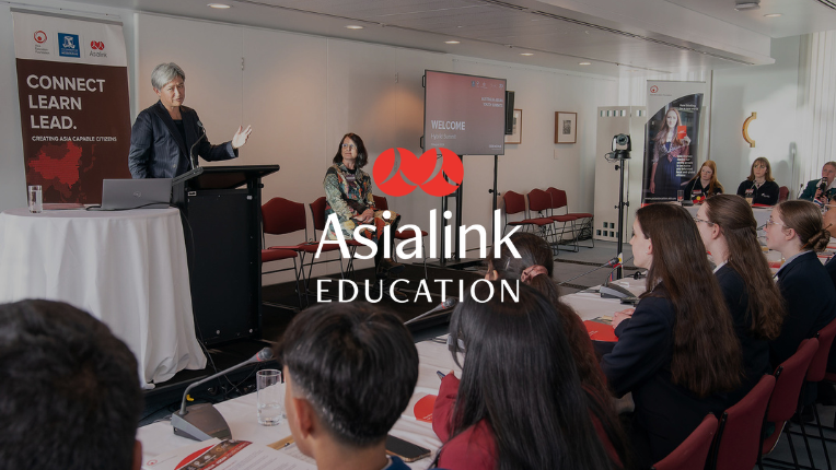
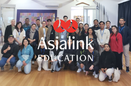
About Asialink Education
Asialink Education (formerly Asia Education Foundation) empowers school leaders, teachers, students and young professionals with global perspectives, cultural understanding and relationships to navigate a shared future in our region.
Established in 1992, we have been a trusted partner of the Australian Government, state and territory Governments, and philanthropic organisations for 30+ years. Our programs draw on our trusted regional networks to provide life-changing opportunities for young professionals and the primary, secondary and tertiary education sectors to build the knowledge, skills, partnerships and networks need to engage effectively with Asia and the Pacific.
Discover more about the history of Asialink Education here.
How Asialink Education can help


Filter by place
60 available resources


How can we help? Get in touch to discuss how we can help you engage with Asia
